Marketing and Communications Internship with the Center of Excellence in Weather and Climate Analytics March 2025 - May 2026Informational Material in Circulation
The COE booklet
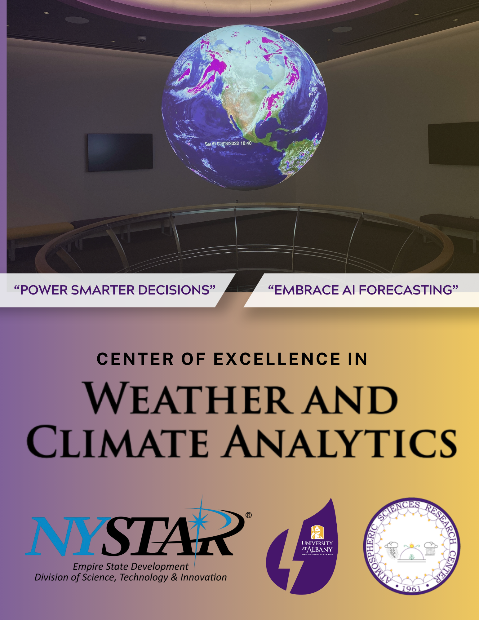
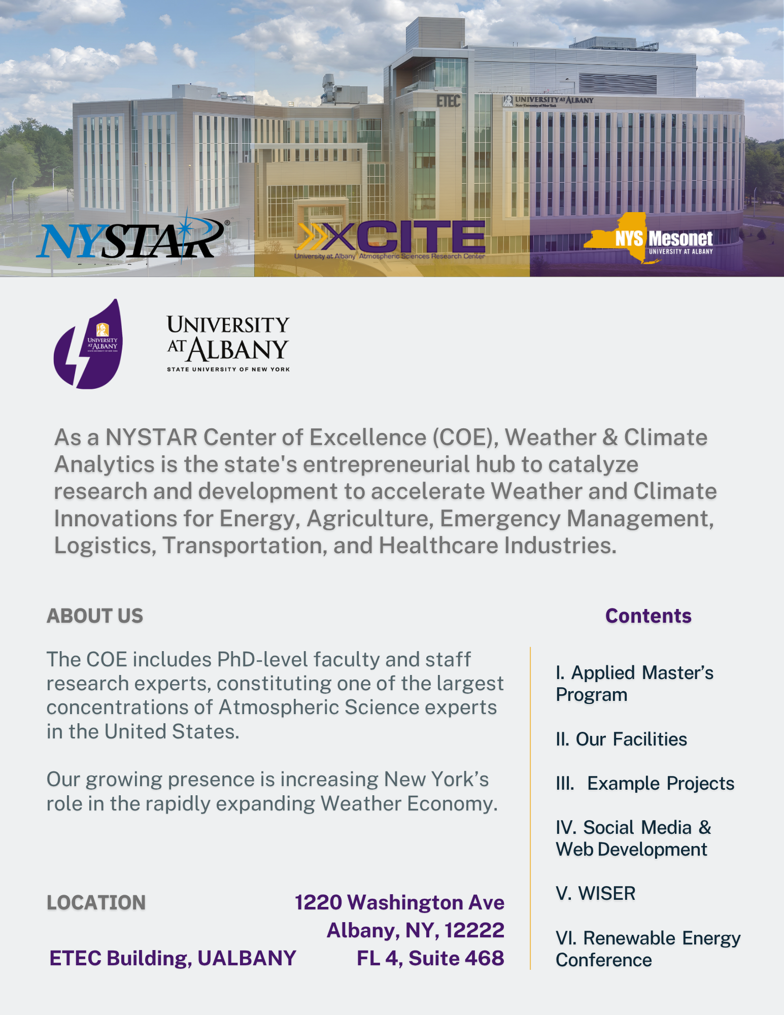
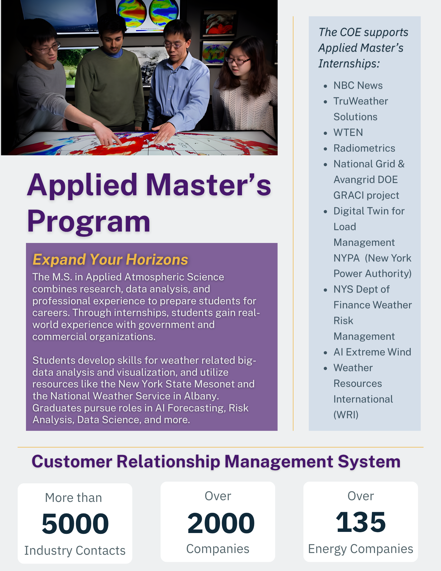
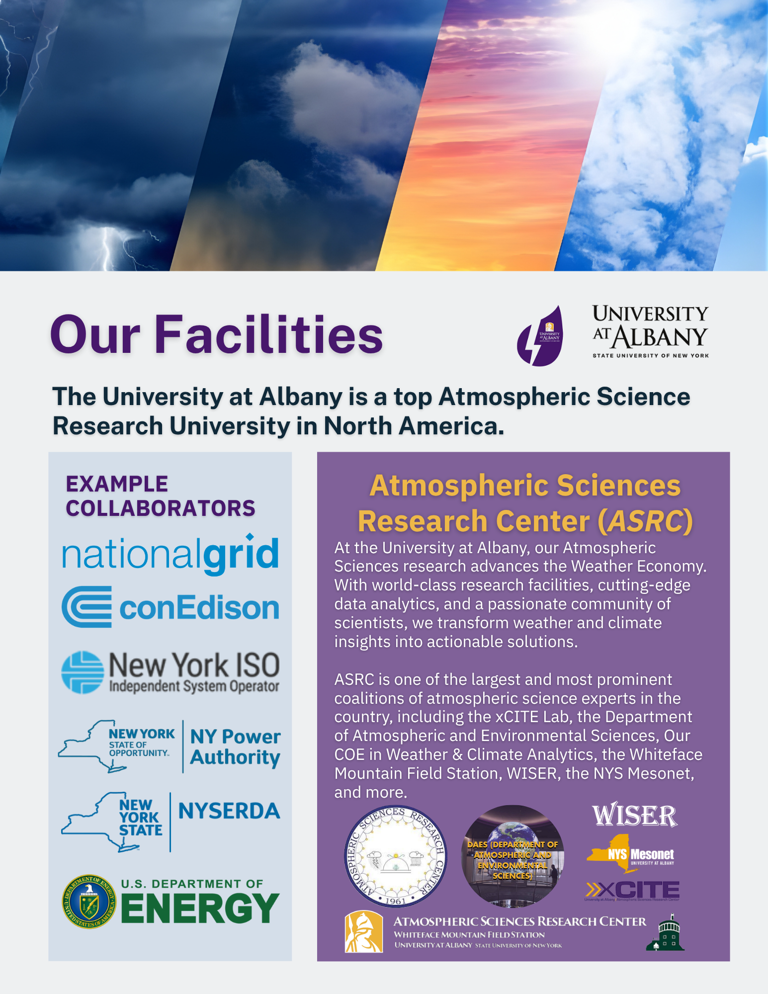
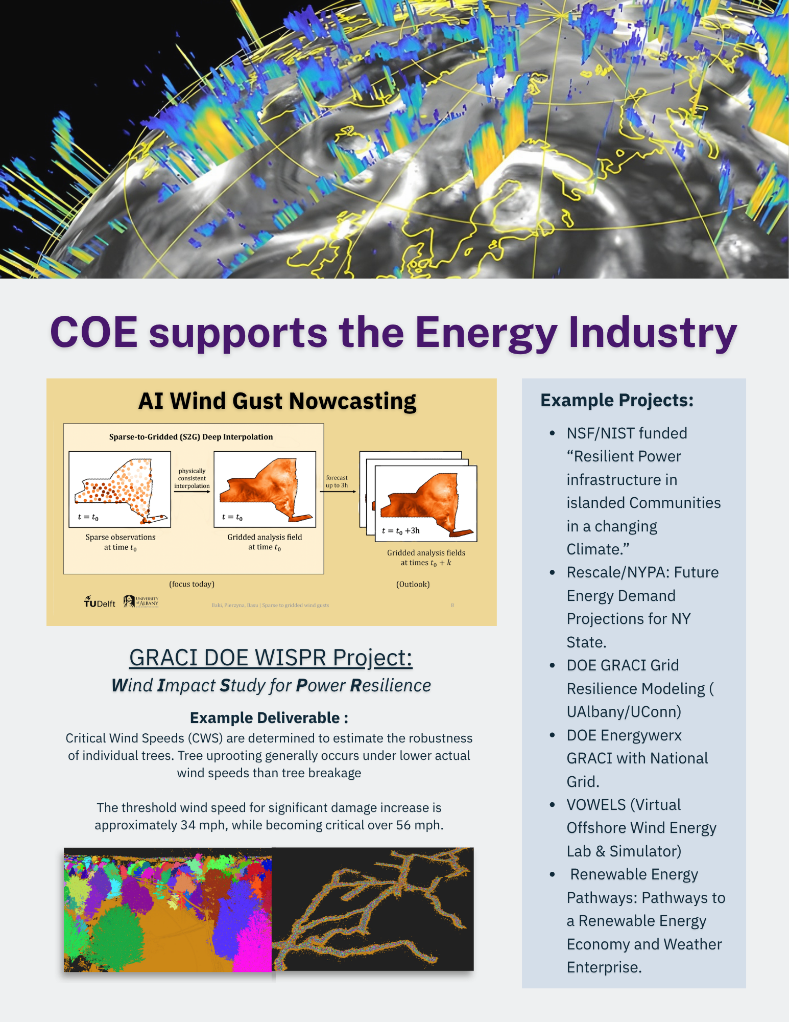
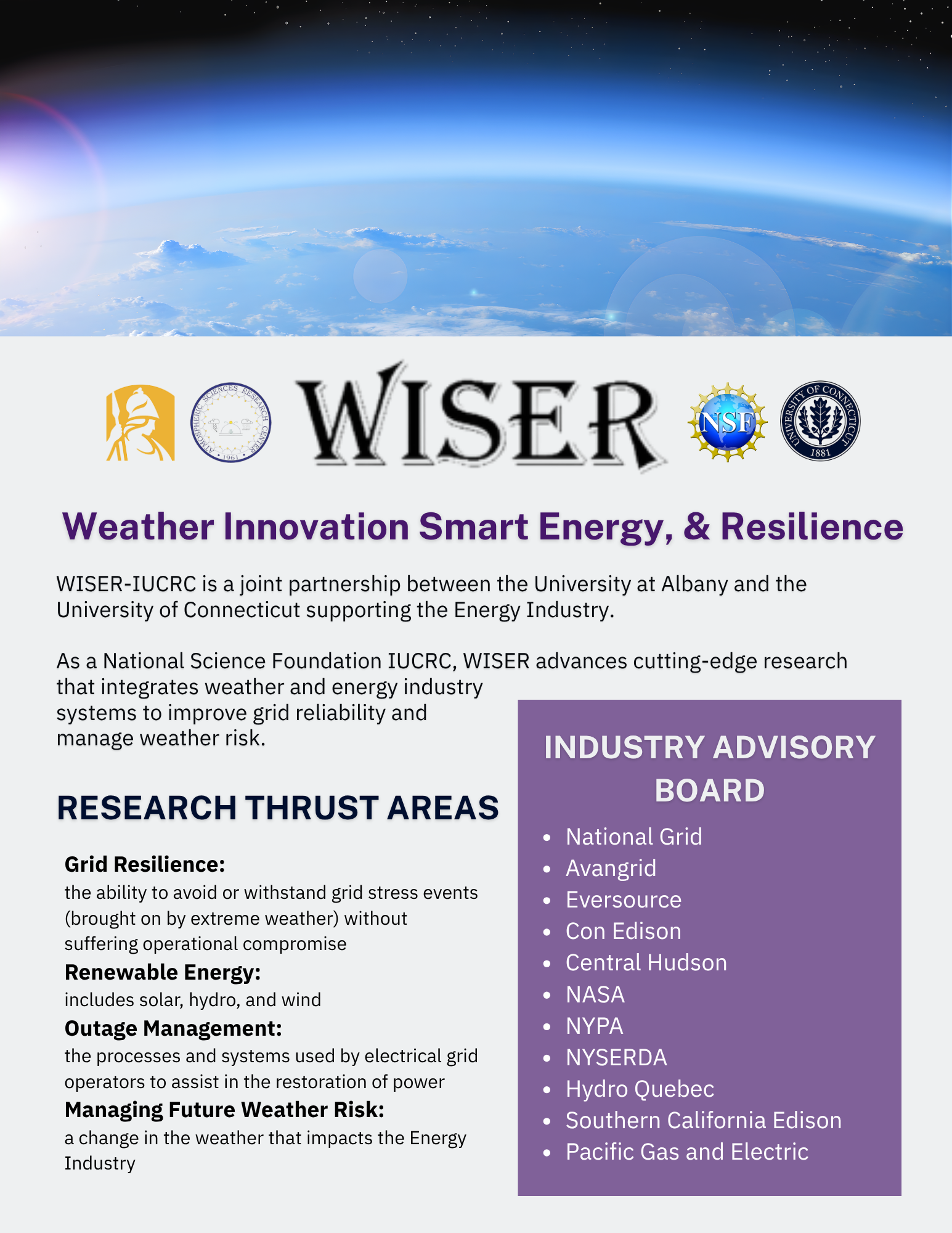
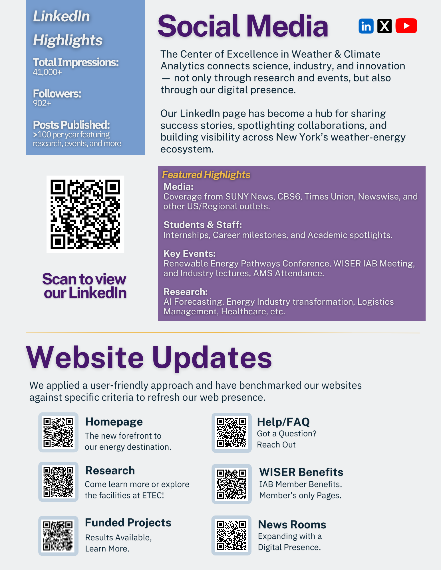
All 8 Pages of this booklet including front and back were designed with intention. Prime real estate on the front is used to show a strong brand identity and alignment with our HQ’s University while the back goes into rotation with our latest ventures.
Together Yeimi & I pulled key information, takeaways, and accomplishments from various sources to string together this cumulative booklet of our efforts - and the overall efforts of the Center of Excellence. We prepared everything general to the best of our understanding and showcased numbers that could use annual or quarterly updating to subtly demonstrate growth between versions. As Yeimi graduated and left the COE a semester earlier than myself, I not only refreshed the booklet myself - creating an entirely new cover, but refreshed her previous 1-pager works with new annually updated information and created my own 1 -pagers for additional projects.
What was originally created with the help co-intern Yeimi Umana as a casual assignment had me combing through each page searching high-and-low for any discrepancies. While I took lead on design/formatting with the original version, before my term of employment concluded, I made sure to update all of the informational material I worked on before it became too late. Although it wouldn’t be impossible for new recruits to familiarize themselves with this material and update it, I think it helps me make an impact with the legacy of my intern class. Being the last to leave (graduate) makes me a little nervous of what might become of my hard work - but taking the time to update everything myself not only cements these works as my legacy setting a standard, it also ensures I leave while providing meaningful longterm contributions to the COE which extend past my employment period.
The North American Project
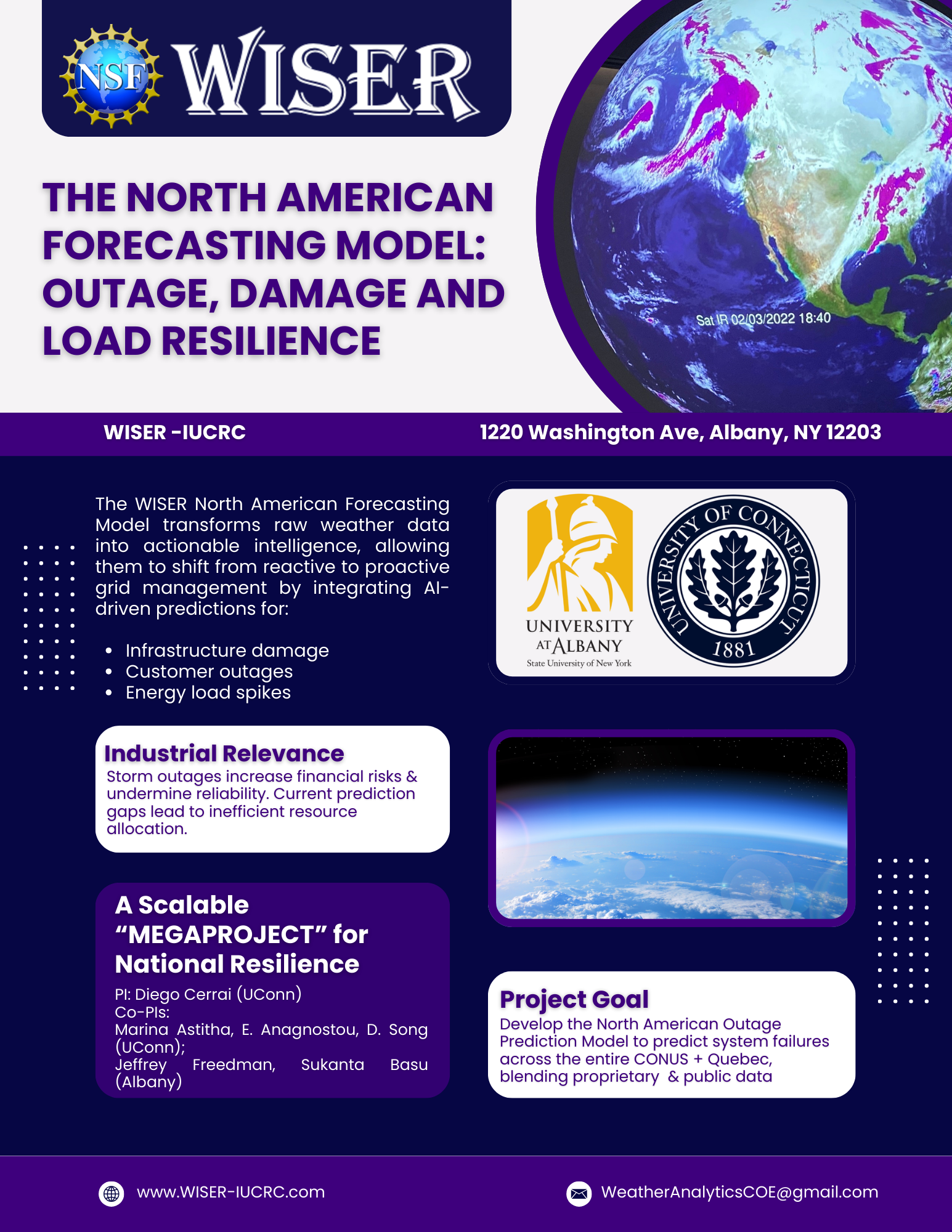
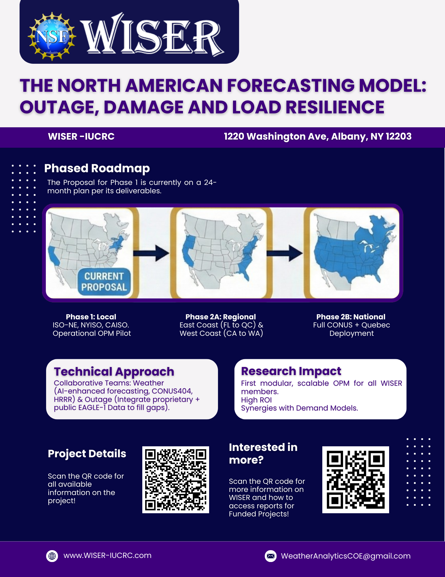
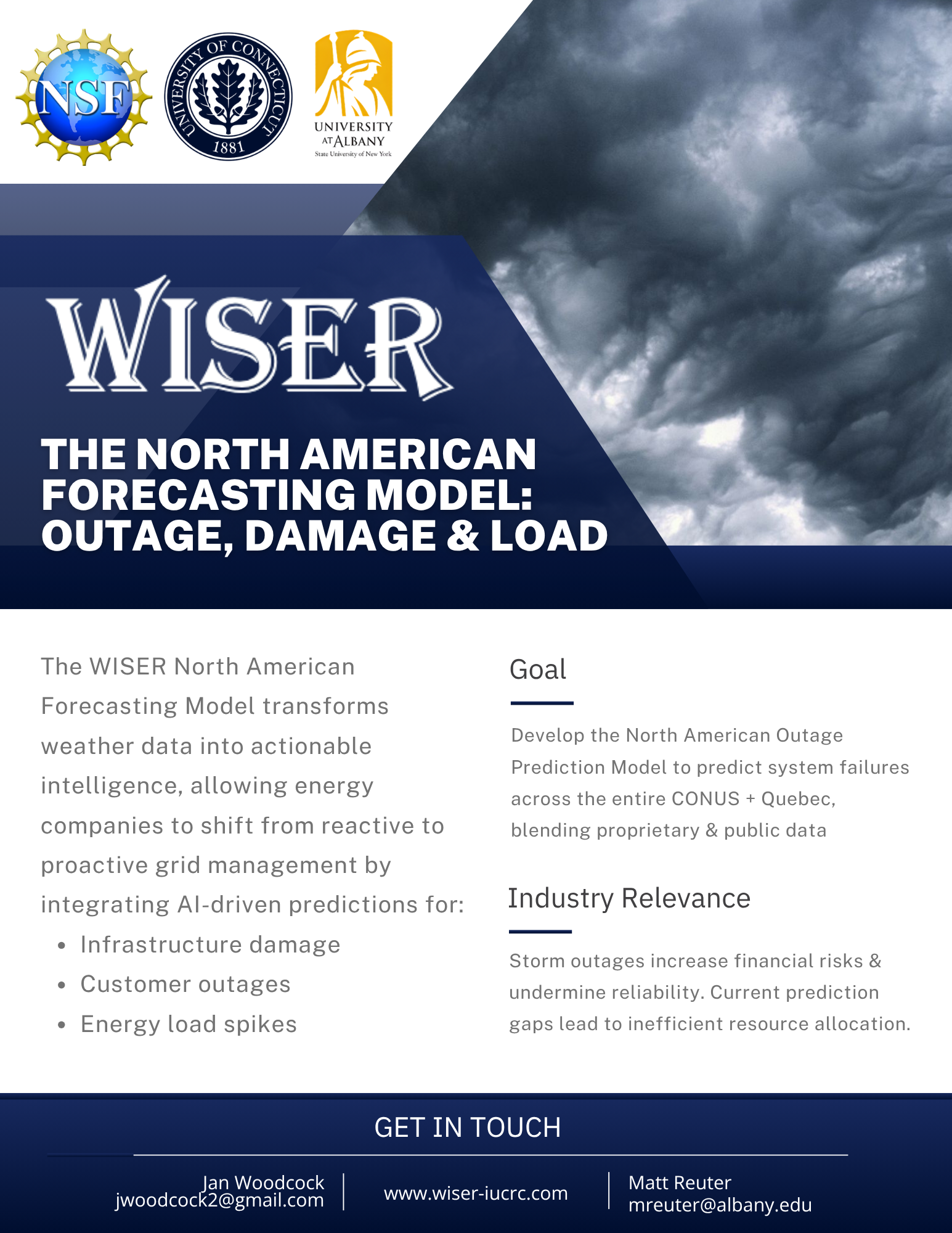
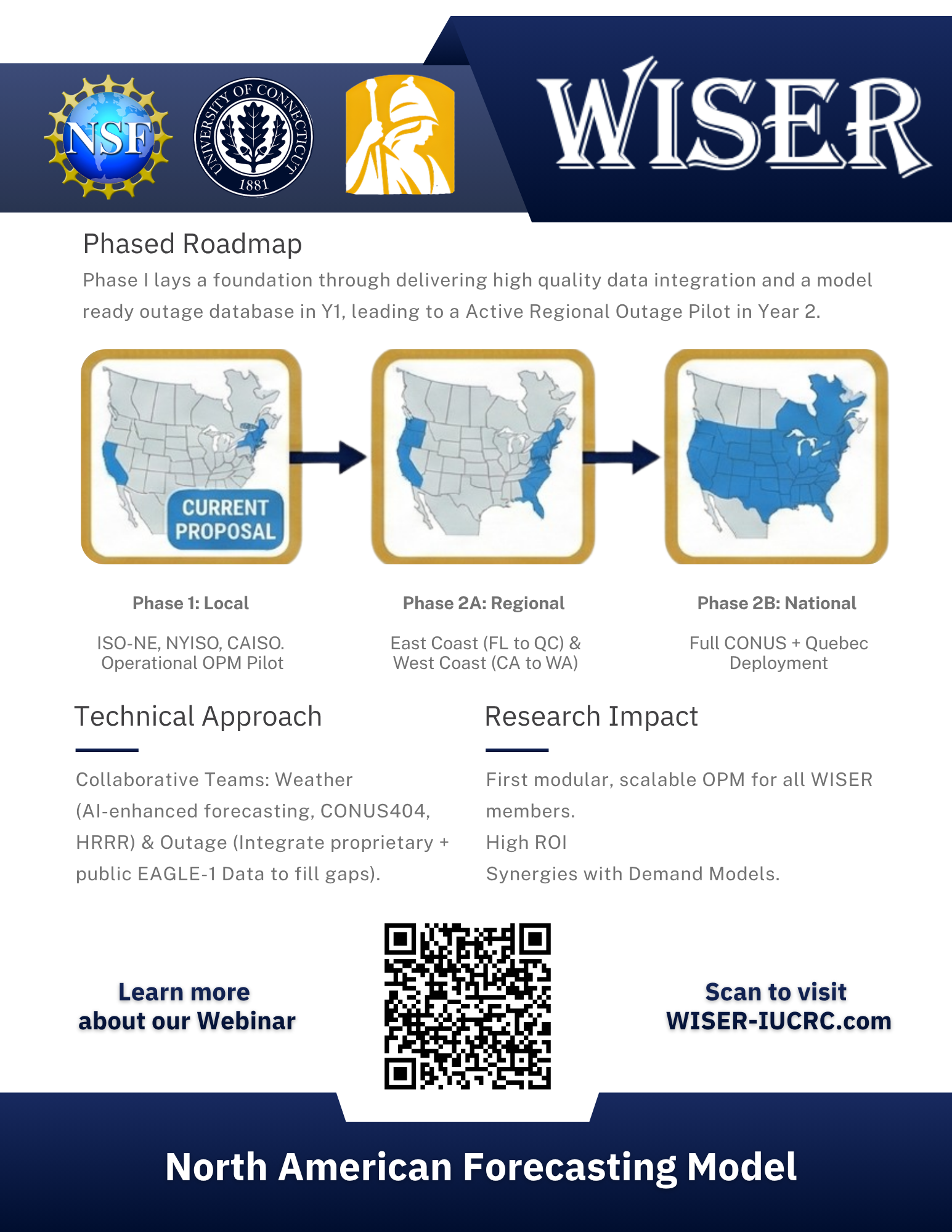
When this Project was confirmed for funding of 250k compared to the casual 50-75k like regular projects - a 1-pager was immediately requested to distribute and promote this project. The purple version underwent a few changes especially with the information on the first page - however post webinar on the North American Model and linguistic finalizations, I decided to move on from V1 to something new. We had also decided on direction for graphics after the first version instead of using the famous globe in our HQ, we shifted to focus on the project which had become quite promoted through the webinar. From there, I’d say the New 1-pager in V2 has a more distinct look.
What would be better than being recognized as part of the University?
With this in mind I created a brand kit to encourage the use of fonts like “Public Sans”, colors like Gold & Purple for COE materials, and colors like our signature Navy for WISER. I started to do all works with this focus - I trained the new interns to recognize this not as a casual font but as our Universities identity. Now our new social media lead uses these colors, these fonts, and media feels more consistent, and V2 of the North American was just the start of recognizable WISER or COE materials.
My goal when setting an alternate design to move forward with was to establish consistency. As I entered the final term of my employment (Spring’26), I began preparing a series of documents such as brand kits & training manuals. While fonts varies between creators when I initially started, after a while of working with my class of interns we began to synchronize in a way. While things weren't perfectly uniform across all of us and all of our medias - work did start to have either Yeimi’s signature or my signature. However, after her graduation, She was no longer there to do social media. Around this time I began to wonder why our webpage wasn’t on the universities official site and instead on our own private domain… After making the COE booklet together, one of the major changes I put into effect was taking the font Trajon Pro, of which the University of Albany uses for signature lettering and with Adobe, input that as text for the booklet’s cover page. Exploring the Universities brand kit inspired me.
This though?
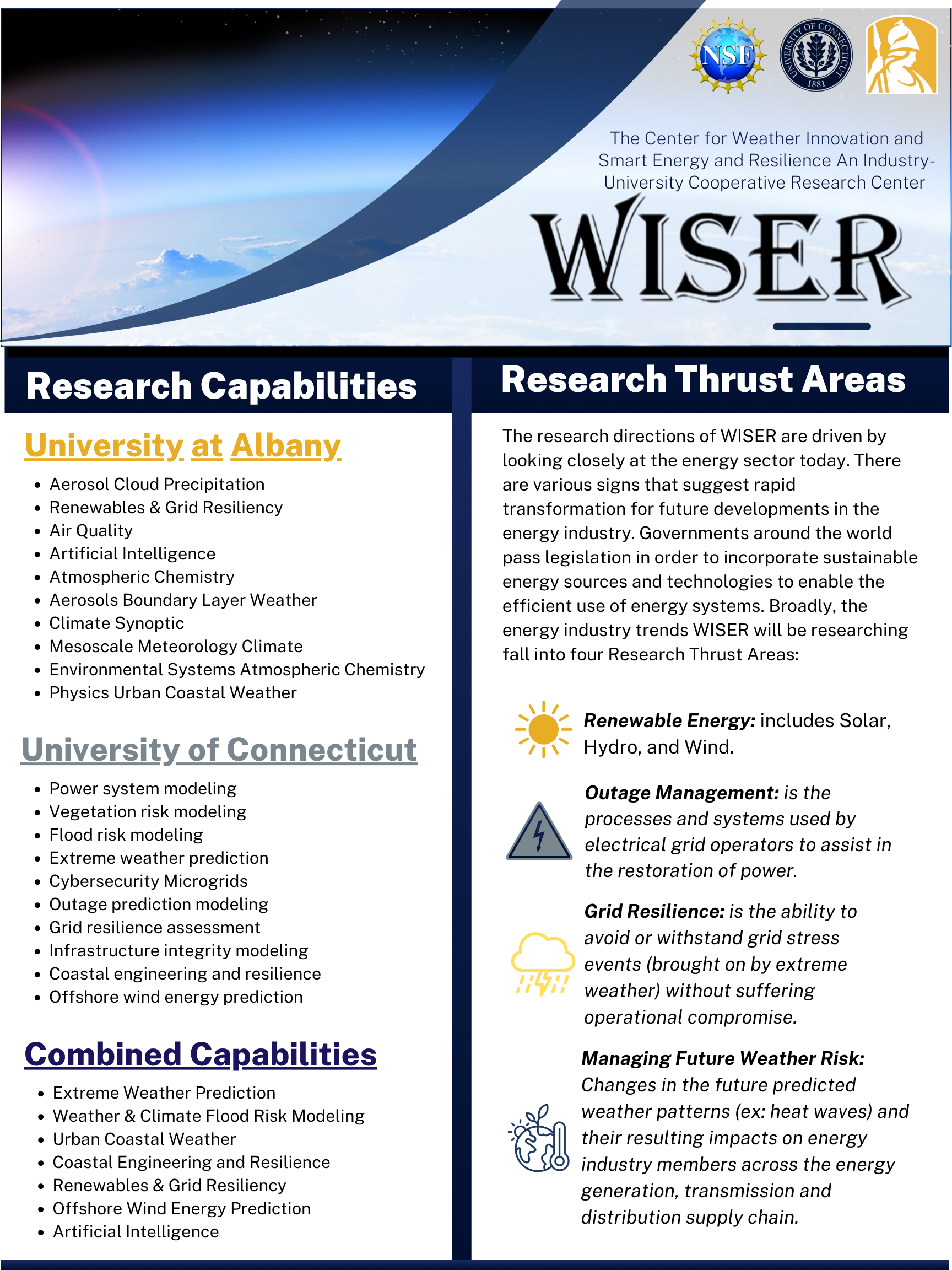
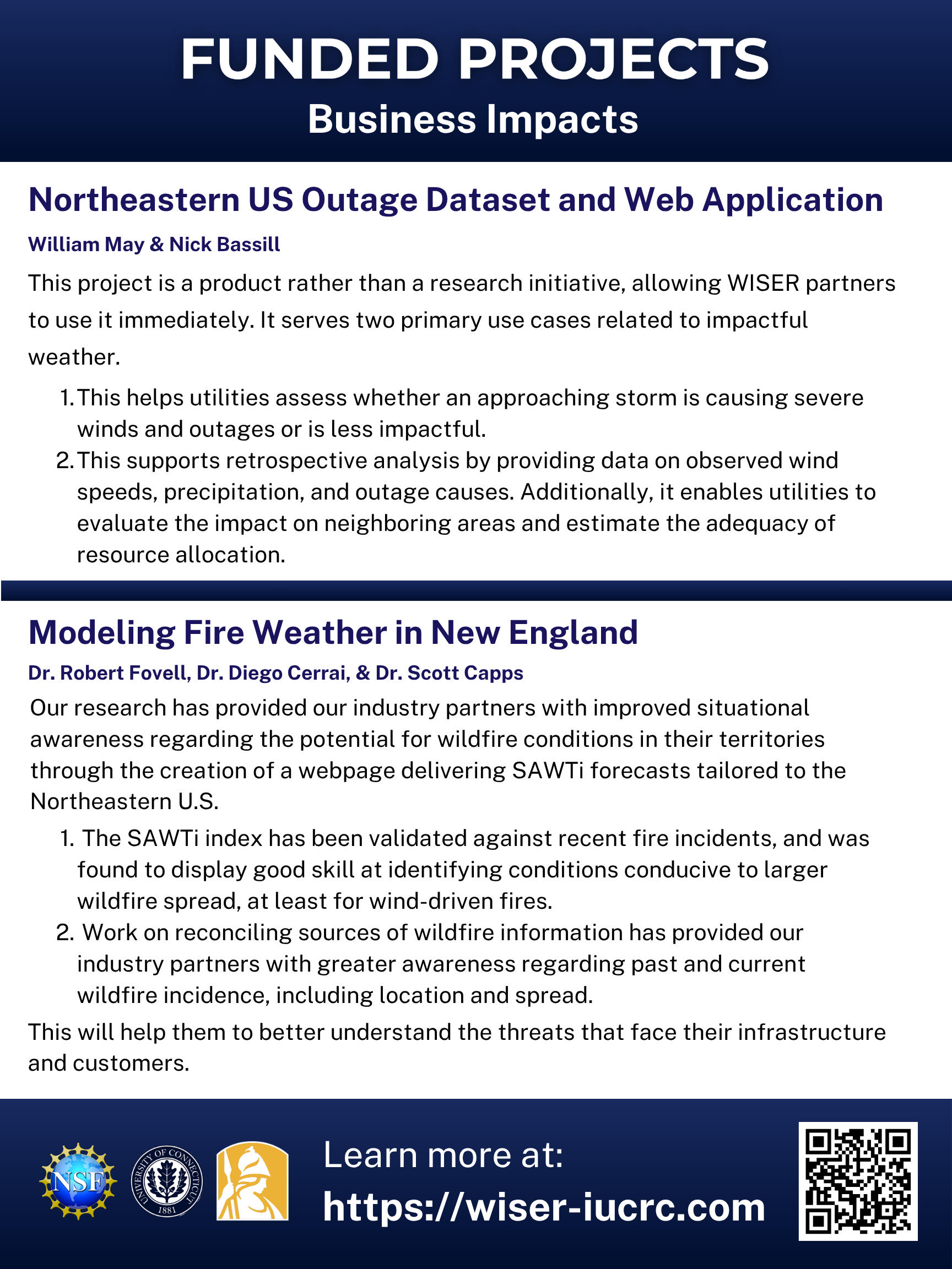
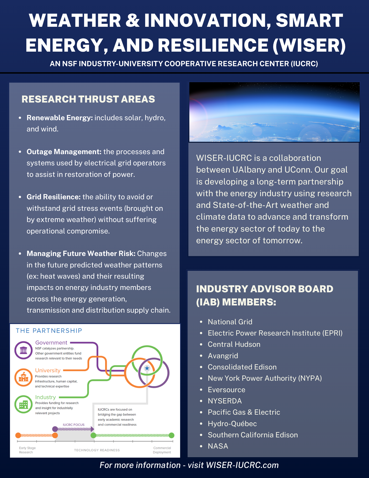
My 1-Pager right next to Yeimi’s Solutions Factsheet. This absolutely makes me nerd out. You can bet that I told her, I showed her, I showed Jan our director, I showed friends, I joke about it - and I’m just not so secretly so excited when my media performs well or stands out. To me - it feels like a job well done.
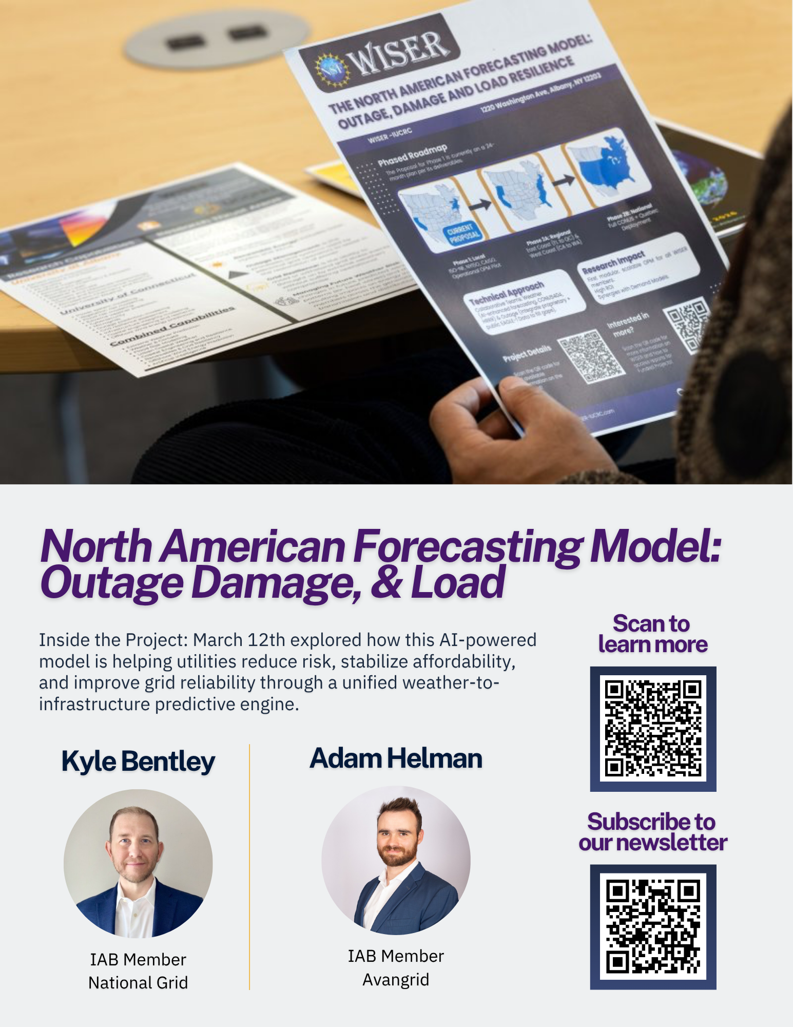
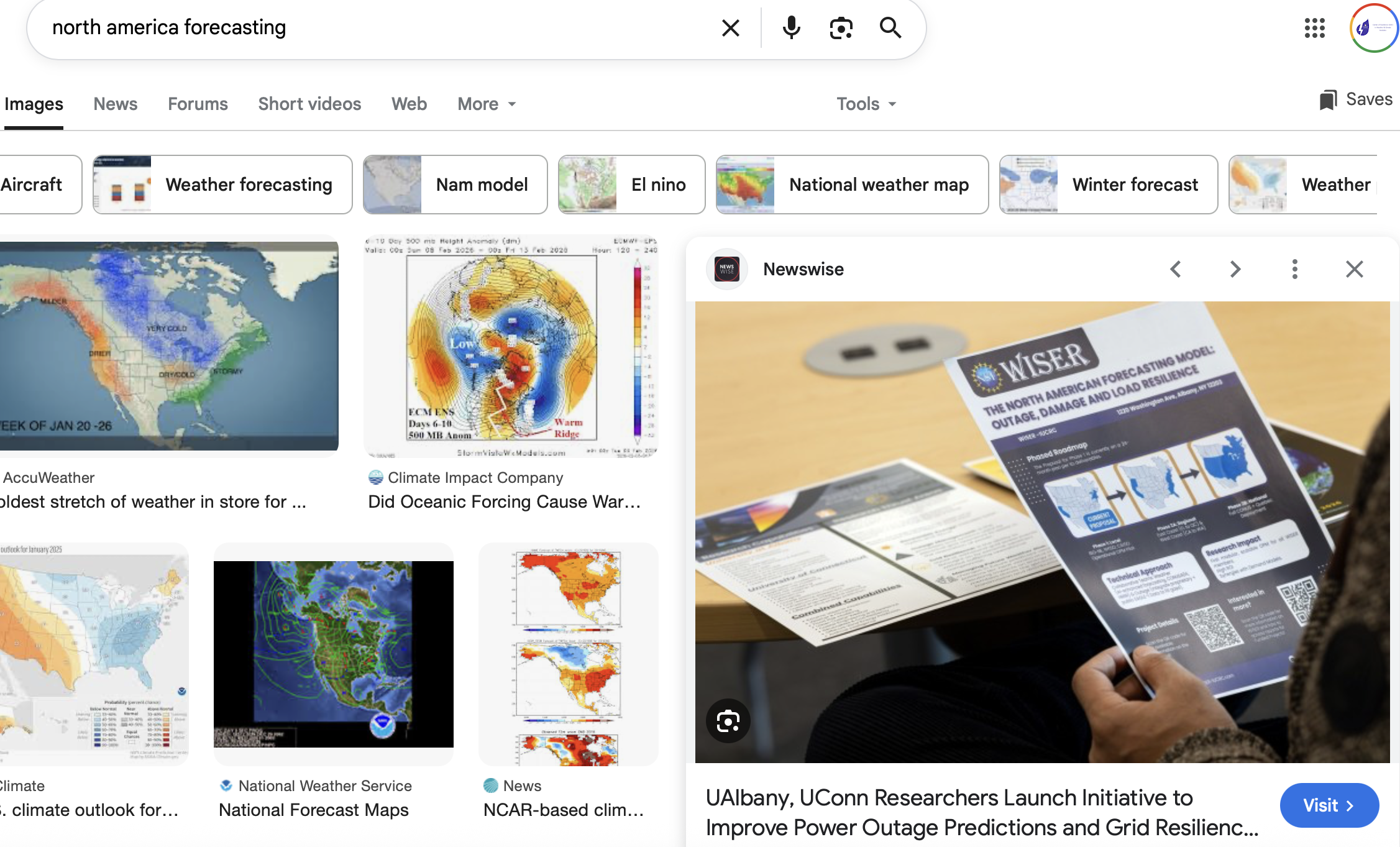
I found this graphic taken by Patrick Dodson from February’s IAB meeting in ETEC (Yes, I worked this event) as one of the top search results under North American Forecasting when looking for graphic inspiration for V2 of the 1-pager.
Yes, I absolutely used this image and gave this fun fact with our Intern’s presentation to the Director Boss of my Boss who’s also a Director…
Yes, I absolutely used this image to showcase supporting materials on the North American Project for the updated back of the COE booklet when updating the event (prime real estate) from the Renewable Energy Conference (September) to the Webinar (March) on the North American Project.
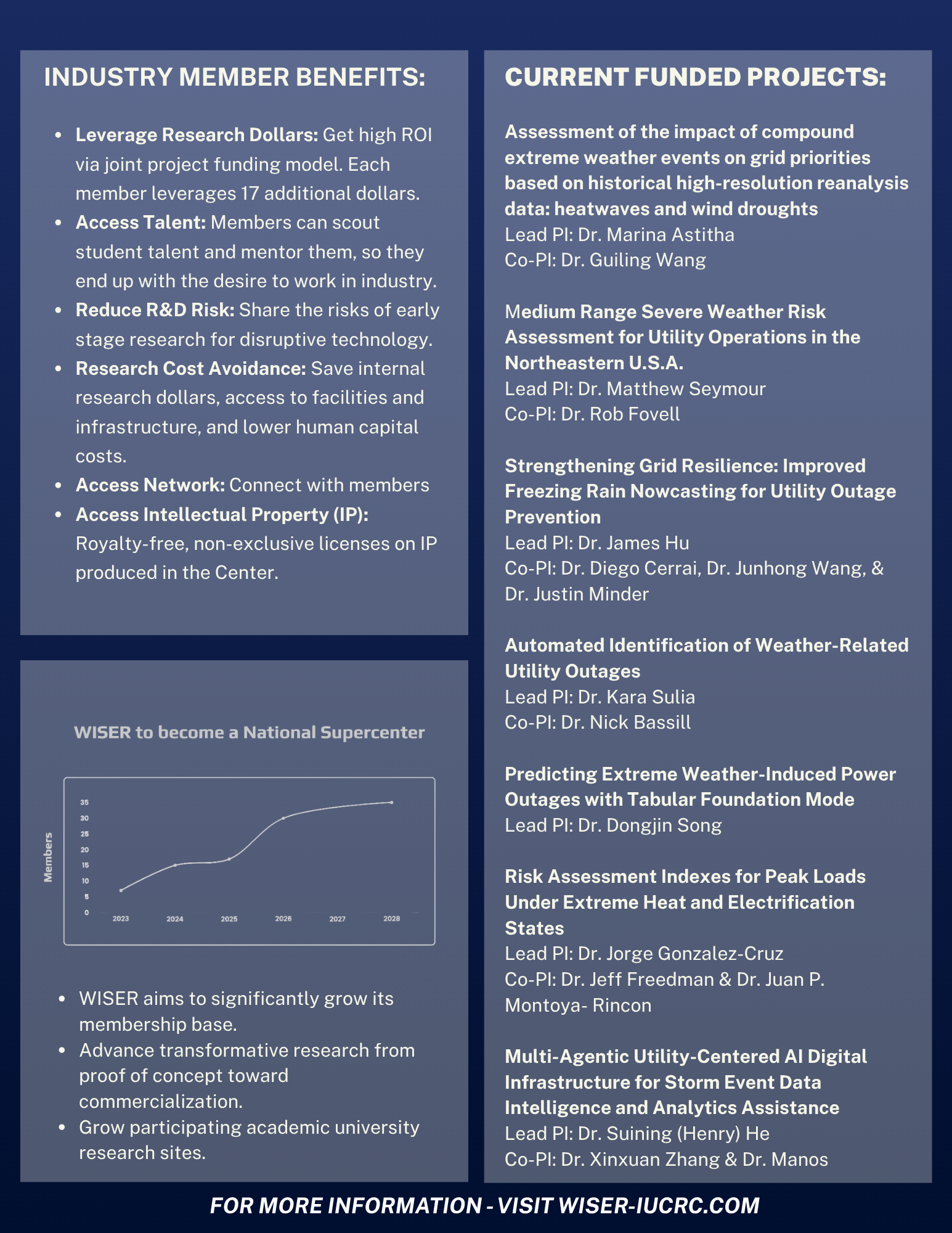
The WISER 1-Pager and Solutions Factsheet
Yeimi originally made these while I focused on WISER’s website additions, and summary reports for the Funded Projects. Now that time’s passed and new projects has been moved to received funding, new annual project results are out, the information had to cycle from the old to the new.
All this information is on our site, let’s give the readers the tiniest bit more insight, let's tie it all together. I’d like to think this sets the tone with my departure. This is what I shall leave them with and so long as this gets used for even one meeting, this would certainly be up to date for the next IAB in June! I hope this material is applicable until at least September in which it gets used for what would be the 4th Annual Renewable Energy Pathways Conference. Even without me being there, I hope that the interns will update this version with new Projects, new Thrusts, new IAB members but possibly feel inclined to create works similar to this with its WISER coded design. That would truly make me feel like a winner.
I never saw any problems with the existing design but specifically saw an opportunity. I’d call this a refresh. The design and concept are there, the information and look are refreshed.
I thought - what better way to recognize WISER than the WISER webpage banner? The WISER colors? How can I make this information more familiar? It was refreshing to be able to touch upon these works. I credit Yeimi to making a piece so familiar to me where I know that I really KNOW this information. She truly made it so easy to recall where everything came from, where I could pull more, and even how I might be able to give it a little more.
Conclusion